Modernizing the Backbone of Microsoft's Commercial Revenue
Microsoft Partner Center

Executive Summary
Partner Center is the supporting portal for hundreds of billions of dollars in revenue for game publishers, commercial software developers, and product resellers. My design team sought to make the portal a best-in-class productivity tool, raise Partner satisfaction, and increase brand confidence through UI/UX quality improvements. This included mapping closely to the Microsoft’s broader design guidance (Fluent), introduce patterns that simplify and drive efficiency, update brand color, and drive consistent implementation within Partner Center.
Along with updating patterns, we created templates and usage guidance to set engineering teams up for success. As we continued to shift the operating model from feature-focussed to more foundational, documentation and templates supported the team’s ability to scale. This workstream was the basis for implementing UX certification and improving quality across the board.
Key focus Areas
There were a number of challenges to achieving our vision of quality for the product, and because the design team was only 4 people, identifying where we should focus energy was integral. We needed to work smart and systemically, and not boil the ocean.
Both through some accumulated research and our own heuristic evaluations, we identified three key areas from which to build:
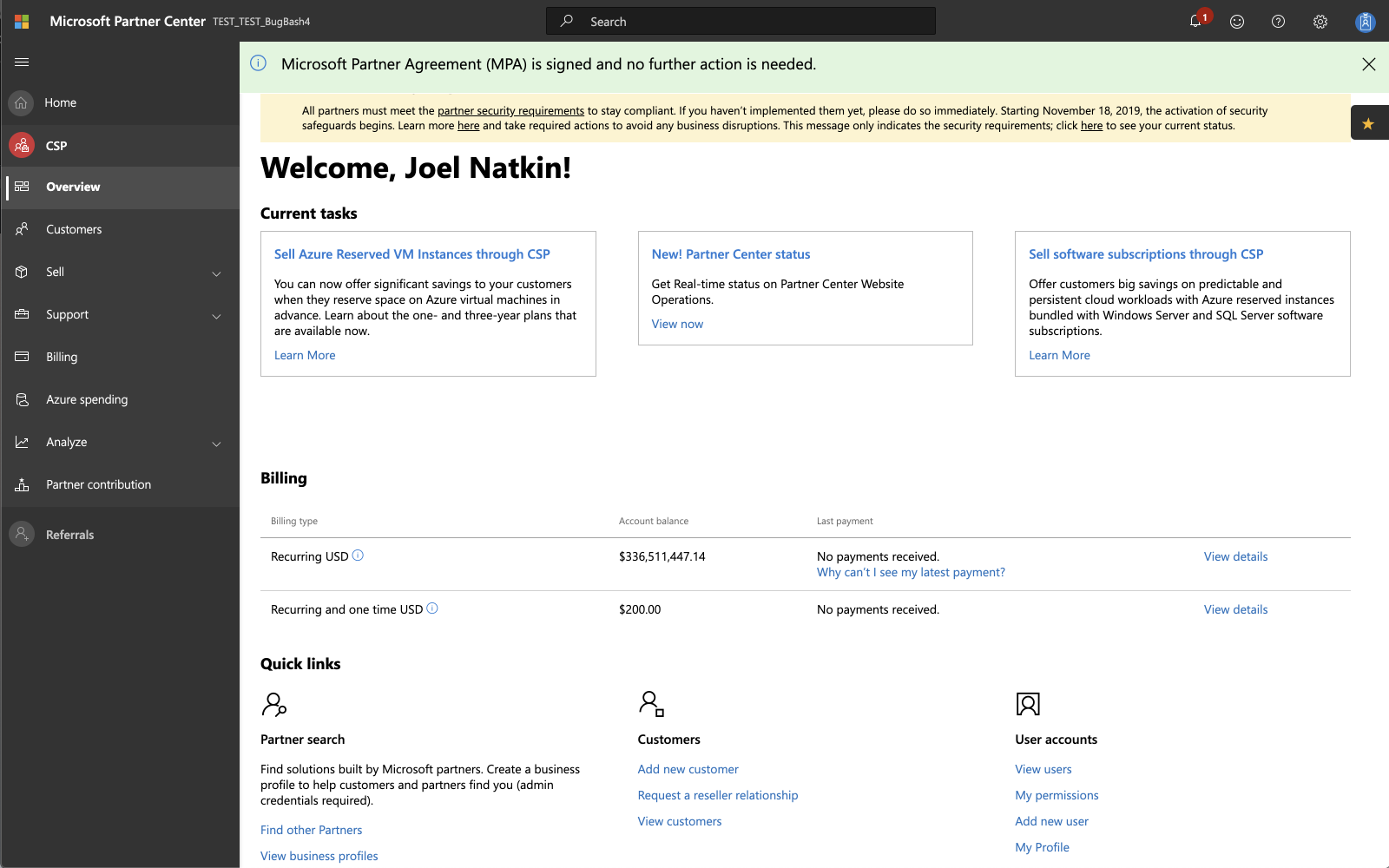
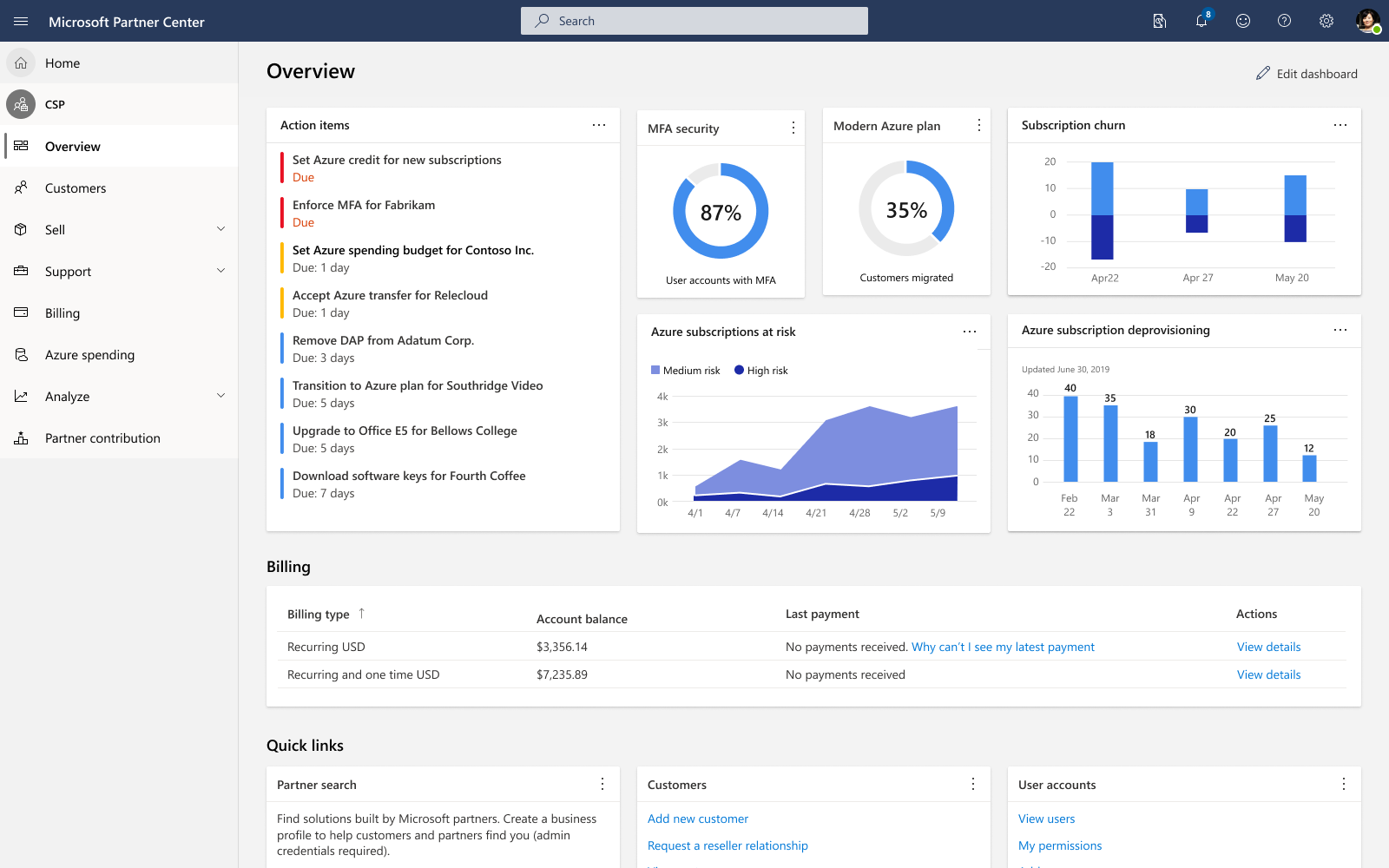
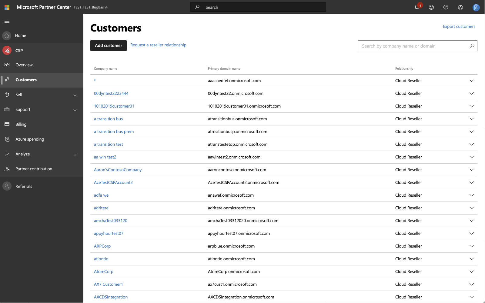
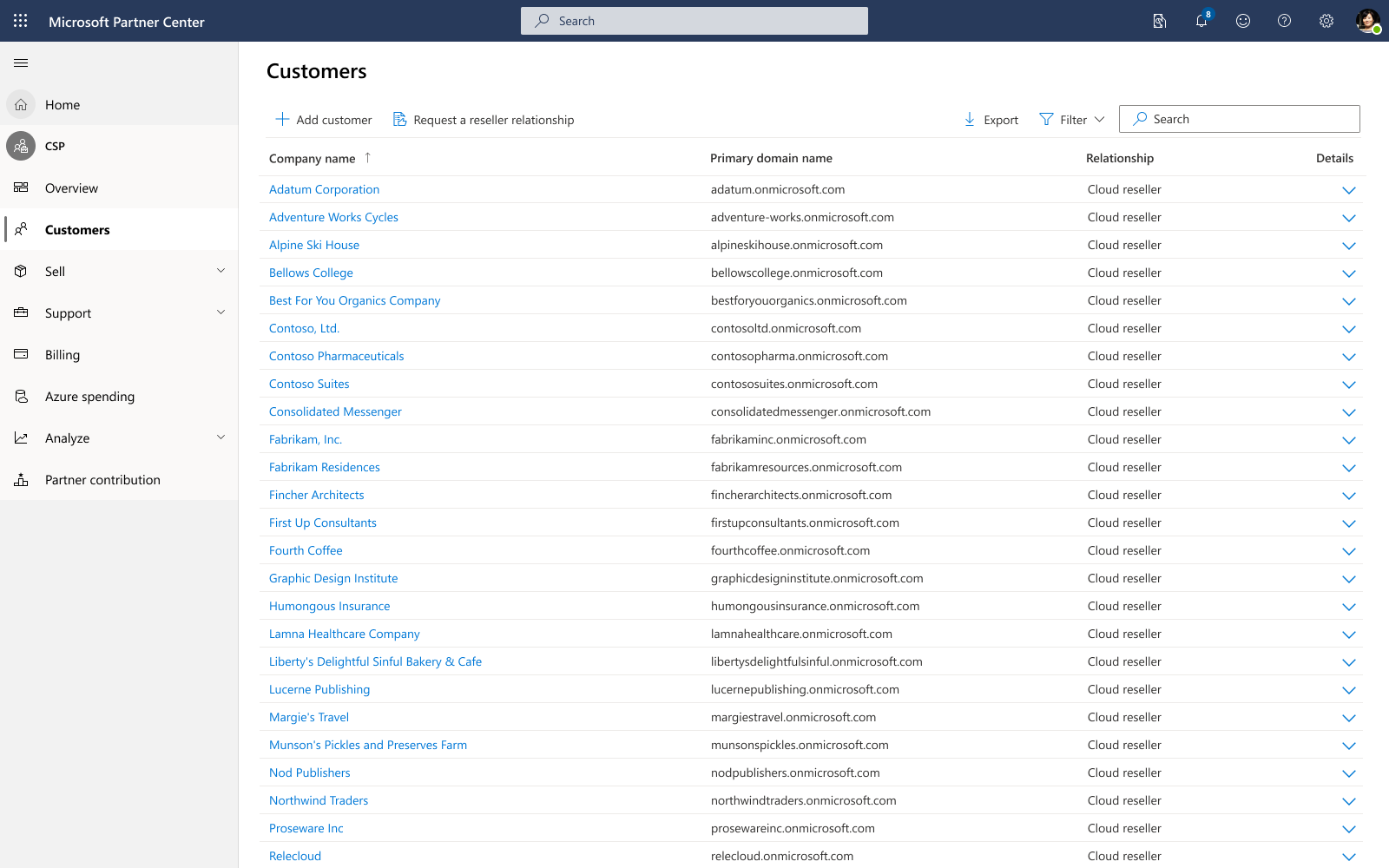
UI Consistency. Partners work across multiple Microsoft sites and tools to complete business-critical tasks. The then-current Partner Center design was based on a previous Microsoft Design Language and the differences between it and the latest company branding are noticeable. Increasing consistency and cohesiveness serve to increase user confidence and present a foundation of professionalism which the site’s workflows and processes could build on.
Navigation. The navigation felt heavy and took away focus and attention from the work area. By looking to visual patterns around depth and transparency and interaction patterns that allowed the user to summon the relevant navigational elements on-demand, users could better focus on the task at hand and transition away easily.
Usability. Many UI elements were serving unclear purposes. Some were overloaded, not scaling efficiently for the large amounts of data often being handled. The best practice guidance we started here served as the basis for the UX certification initiative.
Principles
Accessibility is a paramount responsibility for any shipping product at Microsoft. Besides being a legal requirement, it is a moral responsibility. Anything we create or prescribe needs to meet WCAG 2.1 specifications.
Brand identity. Define a consistent brand identity that fits in the family of Microsoft productivity tools. Further, ensure consistency with partner marketing to weave a narrative across partner web properties (surprisingly, marketing is in a separate organization).
Design efficiency. I keep mention scaling a small design team pretty frequently. This means making smart use of design work done across the company. We find opportunities to adapt and innovate, but we won’t reinvent the wheel.
Performance and predictability. Influence fixes to underlying performance issues, but as a design team, focus on ways to increase perceived performance in everything we create.
Format and Output
In January 2020, I took the design team “offline” for a week-long design sprint to kick off this initiative. We invited designers from other productivity portals in order to leverage experience and expertise. The timing was important for two reasons: I thought this would be a creatively invigorating way for the team to start the year and I figured that I could get away with the whole team disappearing because I all of our PM counterparts would have a holiday hangover.
The output of the mini-sprint was a presentation showing several high-value workflows re-imagined in the updated style, using our principles, with a series of recommended next steps to make this vision a reality.

We introduced a brand color to be adopted by the portal and the marketing sites to show cohesion across Partner experiences.
Long-Term Impact
My initial goals were to start the year with a fun, creative project for the team and start roadmap for design framework improvements. Once we started getting the ball rolling on modernizing the component library, the need to address consistency and quality implementation across the board kept coming up. In order to successfully move the design of the portal forward, it became clear that we needed to address the other major foundational issue: the tech and design debt accrued through rapid expansion. This helped expedite the design team’s shift in operating model and allowed us to lead a number of high-impact projects like a navigation and information architectural overhaul, the UX certification process, onboarding standardization, contextual help strategy, and more.